But, Frank Quitely decided to redesign the S-shield (making it look really stupid, mind you), and DC decided to redraw all the shields in the book. Decent idea.
Too bad they had a nearsighted chimpanzee with three fingers do the touch-ups. Honestly, I've never seen the shield look more out of place, poorly-drawn, and inconsistent as it does in "A-SS." DC, you've got the damn shield in your clipart, you couldn't make it look better than that?
And Quitely, what the hell? You can render everything in exquisite detail, but the most recognizable symbol in comics baffles you?
Update: From Lying in the Gutters, here's a side-by-side comparison of the redrawn S-shield (top) and the Quitely aSs-shield (bottom). I'll try to get a scan of one of the more flagrant screwed-up retouches later today.

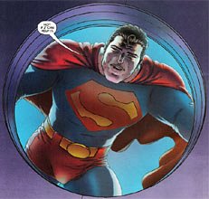
God, that's awful.
2 comments:
I don't know. The first one is assymetrical. The second one looks funny, but still. Not all that bad.
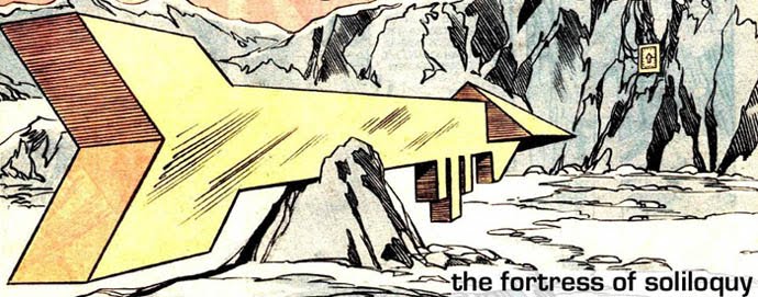
The redesign is a little wide around the sides, but otherwise I like it. I believe it was Grant's idea to have Frank draw up a new shield... sort of a hybrid of all the older version, and pushing forward toward the one we saw in DC One Million.
Of course, DC wanted to preserve the brand.
Post a Comment